Simple or Intricate? How to Choose the Right Coloring Page
Not sure whether to reach for a bold simple design or a dense intricate pattern? Here's a practical guide to choosing the right coloring page for your mood.
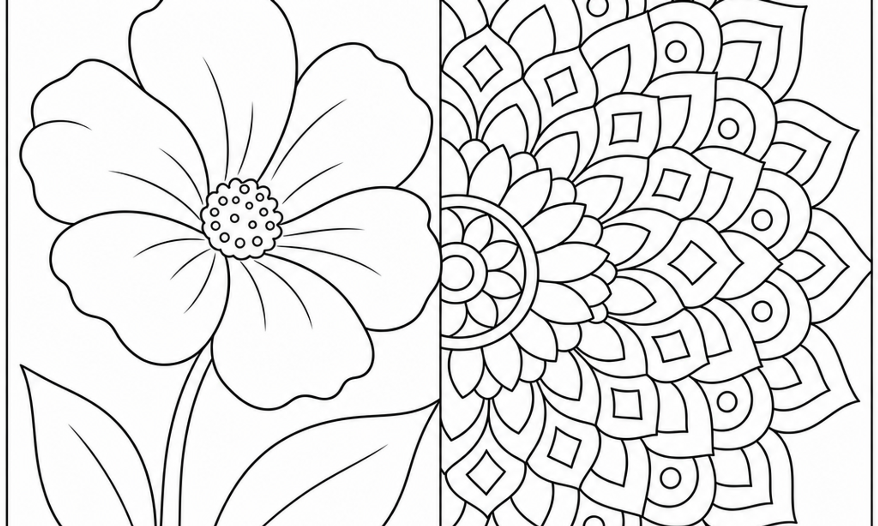
Standing in front of a stack of coloring pages, or scrolling through a library of them, is its own small decision. Do you want a page with a few bold shapes you can fill in ten minutes, or one with hundreds of tiny compartments that could occupy an entire evening? Neither choice is more serious or more worthwhile than the other. They simply serve different moments, and learning to read your own mood is the real skill behind a satisfying coloring session.
This guide is about building that judgment: what simple and intricate pages are actually offering you, and how to pick between them depending on your time, your energy, and what you're hoping to get out of the page in front of you.
What Makes a Page Simple or Intricate
The difference usually comes down to a few visual elements working together. According to the J. Paul Getty Museum's overview of formal analysis, line, shape, space, and texture are the basic building blocks of any composition. A simple coloring page tends to rely on fewer, larger shapes with generous negative space between them. An intricate page layers many smaller shapes, repeating patterns, and finer line work, which creates more edges to track and more decisions to make about color placement.
Neither approach is objectively better. The Getty's materials note that curved lines often read as softer and more organic, while horizontal and vertical lines in combination suggest stability. A simple page built from a few wide, curving shapes will feel different in your hand than a mandala built from dozens of narrow repeating segments, even if you use the exact same pencils on both.
Simple Pages: Fewer Shapes, More Room to Breathe
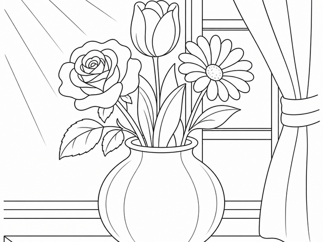
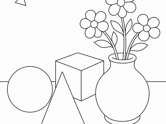
Simple pages typically have:
- Large, clearly defined shapes with wide open areas
- Minimal background detail
- Fewer total color decisions to make
- A design that can often be completed in one sitting
These pages tend to suit moments when you want a quick, low-pressure creative pause, or when you're coloring alongside a conversation, a podcast, or a child who also wants to color something.
Intricate Pages: Layers, Repetition, and Slow Build
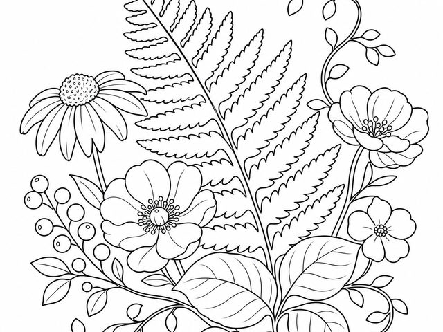
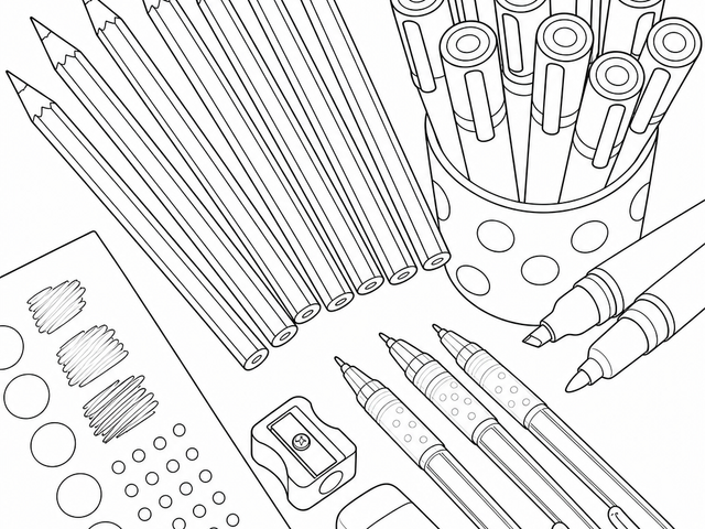
Intricate pages usually include:
- Dense patterning, repeated motifs, or fine linework
- Many small enclosed areas
- Opportunities for gradual shading, blending, and layered color
- A longer total completion time, sometimes across multiple sessions
These pages reward patience. If you enjoy the quiet, repetitive motion of filling in one tiny section after another, an intricate design can offer a long, steady rhythm rather than a single short session.
Matching the Page to Your Mood and Time
A practical way to choose is to ask two honest questions before you open a page: how much time do I actually have, and what does my attention feel like right now.
If you have 10 to 15 minutes and a scattered mind, a simple page is usually the better fit. Fewer shapes mean fewer decisions, so you're less likely to feel rushed or to abandon the page half-finished. There's a real satisfaction in completing something, even something small, in one sitting.
If you have an open evening and feel like settling in, an intricate page can become a quiet, absorbing project. NHS guidance on mindfulness describes paying close attention to small physical details, like the texture of a banister or the temperature of the air, as a way of anchoring attention in the present moment. Tracking a dense pattern section by section can offer a similar kind of close, steady attention, though it's worth being clear that coloring itself has not been established as a validated mindfulness treatment. It can simply be a pleasant way to practice noticing small details.
If you're coloring to unwind after a demanding day, consider which direction actually relaxes you. Some people find that a simple page lets their mind wander freely over broad color fields, which feels restful. Others find that an intricate page's repetitive small movements are what quiet a busy mind. There's no universal answer here, and it's worth experimenting with both to learn your own preference rather than assuming one is automatically more calming.
Practical Tips for Each Type of Page
Working With Simple Pages
- Use bold, saturated color in large areas to make the most of the open space. The Getty's notes on color describe how intensity, the purity or brightness of a color, can carry emotional weight on its own, even without fine detail to support it.
- Try layering two or three shades within a single large shape instead of using flat color, to add subtle depth without needing extra lines.
- Keep a selection of broader-tipped pencils or markers on hand, since large areas can be tedious to fill with a very fine point.
Working With Intricate Pages
- Work in small sections rather than trying to plan the whole page's palette at once. Choosing colors for one cluster of shapes at a time can make a dense design feel more manageable.
- A finer pencil point helps keep small areas crisp. Sharpening often, or using a mechanical colored pencil, can save frustration.
- Paper matters more as detail increases. Manufacturer guidance from Legion Paper notes that colored pencil artists often look for paper with enough tooth, meaning surface texture, to hold multiple light layers without becoming oversaturated. This is drawn from individual artists' preferences rather than a universal rule, so it's worth testing a page or two of your usual paper with some test strokes before committing to a long intricate project, especially if you plan to layer colors heavily.
Caring for Finished Pages, Simple or Complex
However much time you put into a page, you may want to keep it looking good. The Library of Congress's preservation guidance for works on paper, while written for archival materials rather than everyday coloring pages, offers a few simple habits worth borrowing: keep pages away from direct or intense light, store them flat or rolled rather than folded, and avoid paper clips or tape directly on the artwork. You don't need archival-grade storage for a coloring page, but a flat folder in a drawer, out of direct sun, will keep colors from fading or paper from yellowing as quickly.
A Note on What Coloring Can and Can't Do
It's worth being clear-eyed about what a coloring session is. Coloring can be a self-care activity, but it is not art therapy or a substitute for mental-health care. The American Art Therapy Association is explicit that art therapy is a distinct mental health profession practiced by credentialed clinicians, and that recreational coloring books, however enjoyable, should not be labeled as art therapy. That distinction doesn't make recreational coloring any less worthwhile. A ten-minute simple page or a three-hour intricate one can both be genuinely good uses of your time, just not clinical ones.
Building Your Own Rotation
Over time, many people find it useful to keep both types of pages on hand rather than committing to one style. A folder of quick, simple designs for busy days, and a few intricate ones saved for a weekend afternoon, means you're never stuck without the right page for the moment you're actually in. Pay attention to which ones you reach for and which ones you return to half-finished. That pattern will tell you more about your own preferences than any general rule ever could.
Whichever page you pick up next, the real goal is simple: a few unhurried minutes with a pencil in hand, color building up stroke by stroke. Open your coloring library, notice how you're feeling right now, and let that decide whether today is a bold, simple day or a slow, intricate one.