Shading and Dimension: Making Flat Coloring Pages Come Alive
Learn how a single light source, layered pencil pressure, and a little patience can turn any flat coloring page into something with real depth.
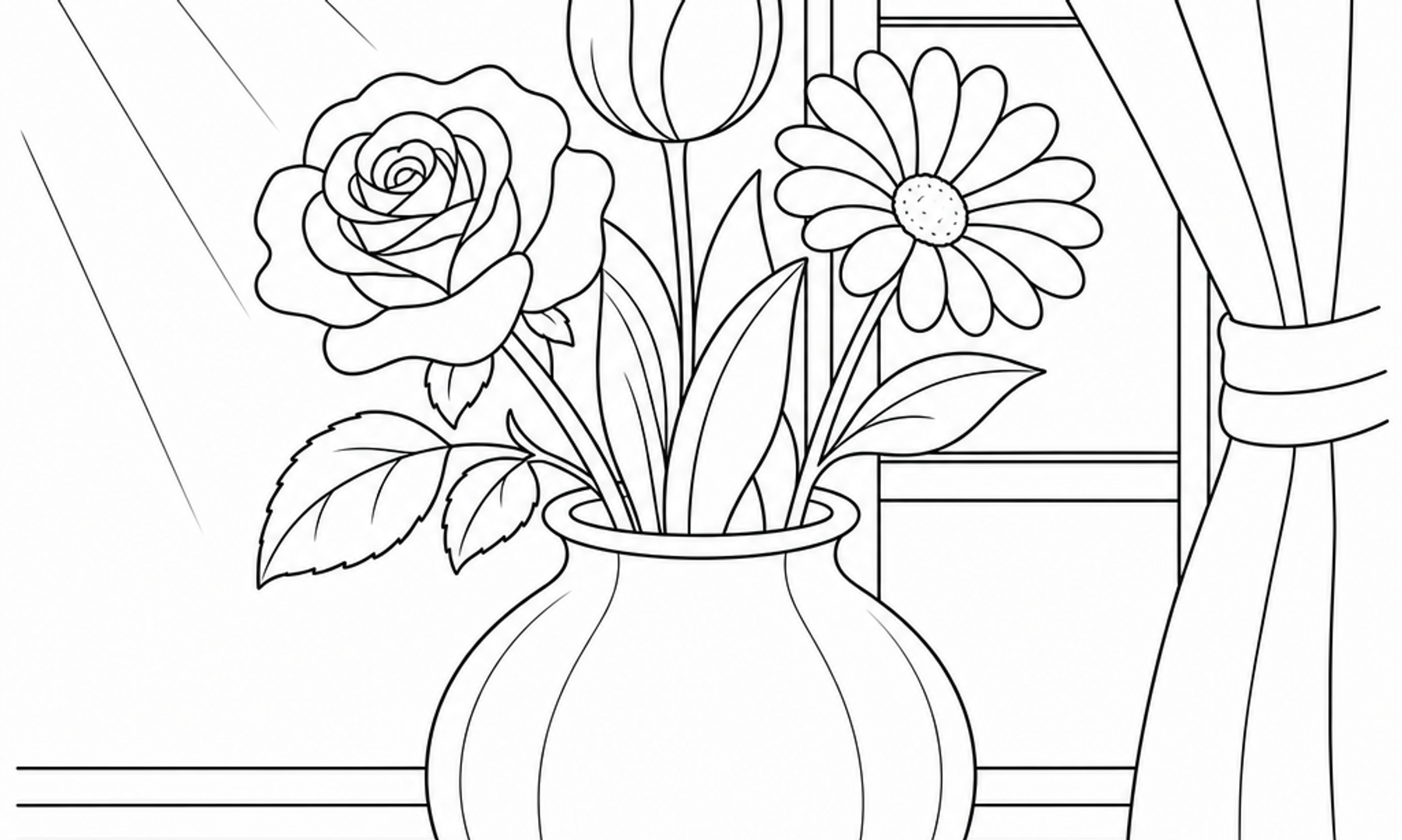
Every coloring page starts flat. Lines on paper, waiting. What turns those lines into something that looks round, lit, and dimensional isn't a secret trick. It's a handful of observable habits borrowed from drawing and painting, translated into something you can do with the pencils already in your tin.
This guide walks through the practical side of shading: picking a light source, building value gradually, and using pressure and layering to suggest depth on a page that is, technically, just ink on paper.
Why Flat Pages Look Flat
A coloring page is made of line and shape. According to the J. Paul Getty Museum's overview of the elements of art, shape has only height and width, while form has depth as well (getty.edu). The outlines on your page define shape. Dimension is something you add through value, which the Getty describes as how light or dark a color is. When every petal, leaf, or fold is filled with one flat tone, the eye reads it as shape. When you introduce a range of light and dark within that same shape, the eye starts to read it as form.
The Getty's materials also note that the illusion of three-dimensional space in a two-dimensional work is achieved through perspective and shading, pointing to Dutch painter Pieter Saenredam's architectural interiors as an example of artists laboring over exactly this illusion. It's worth remembering that this is an illusion built through observation and choice, not a formula with one correct answer. Two colorists can shade the same flower differently and both versions can look convincing, because both are internally consistent with their own light source.
Choosing a Light Source (and Sticking With It)
The single most useful decision you can make before shading a page is choosing where the light is coming from. This doesn't need to be scientific. Pick a direction, upper left is a common and comfortable choice, and imagine light traveling from that point across the whole image.
A Simple Way to Practice
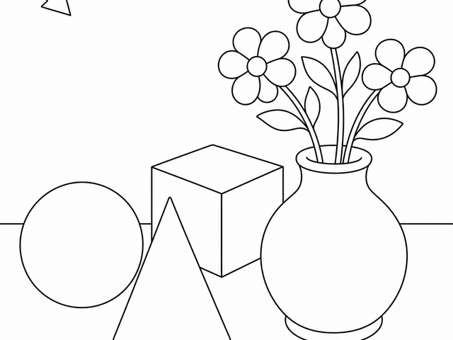
- Look at one shape on your page, a circle, a leaf, a mug.
- Decide where the "sun" is for that image.
- Mark lightly in pencil (not ink) where the highlight would fall, closest to the light.
- Mark where the shadow would fall, on the side farthest from the light, and where the shape touches another surface.
- Leave the highlight area lightest, sometimes even the white of the paper, and build the shadow side with more layers of color.
The Library of Congress's preservation guidance reminds us that pencil, not ink, is the appropriate tool for any marks you don't want to be permanent (loc.gov), which makes pencil ideal for this kind of light sketch-planning directly on your coloring page before you commit with pencil color or marker.
Once you've chosen a direction, keep it consistent across every object in the scene. A page with a flower, a vase, and a windowsill all lit from different directions will look busy and confused rather than dimensional. Consistency is what sells the illusion.
Building Value Through Layers, Not Pressure Alone
It's tempting to create a dark shadow by pressing hard with your pencil in one pass. This can work, but it often produces a flat, waxy patch rather than a gradient. A more controlled approach is to build value in thin layers.
- Start with light, even pressure across the whole shape, including where the shadow will eventually sit.
- Add a second light layer only to the shadow side.
- Continue adding layers, slightly reducing the area you cover each time, so the darkest value concentrates in the smallest area, usually where the shape curves away most sharply from the light or touches another object.
- Leave your lightest layer, or the bare paper, for the highlight.
- Step back periodically. Gradual buildup is easier to correct than a single heavy-handed pass.
This layering approach is echoed in how working colored pencil artists describe their own process. Megan Seiter, a colored pencil artist interviewed by Legion Paper, explains that she builds each drawing with dozens of light layers of pencil, which she says gives depth and luminosity to the work (legionpaper.com). That's one artist's documented preference and technique, not a universal rule, but it's a useful model for anyone shading a coloring page: thin layers, repeated, rather than one forceful application.
Paper Matters More Than You Might Expect
The same Legion Paper piece notes that different colored pencil artists prefer different paper textures and weights, some wanting a surface that is "toothy without being heavily textured," others preferring papers that can take layer after layer without becoming saturated. If you're coloring pages printed on thin copy paper, you may notice color lifts off faster or blends less smoothly than on a heavier cardstock. This isn't a flaw in your technique. It's worth testing a page on a few different paper weights if you have the option, the same way professional artists test surfaces before committing to a large piece.
Practical Shading Techniques to Try
A few concrete approaches, worth trying on scrap paper or a spare page before tackling a favorite design:
- Gradient blending: Start dark at the shadow edge and lighten your pressure as you move toward the highlight, so the transition has no hard line.
- Cross-hatching: Layer small strokes in one direction, then a second light layer in a slightly different direction, to deepen value without flattening texture.
- Burnishing: Once you have color down, go over it with a light-colored pencil or a blending tool to smooth the layers together, useful for soft, rounded forms like fruit or faces.
- Color layering for depth: Instead of using only black or gray for shadows, try adding a cooler or more saturated version of the same hue, since the Getty notes that intensity, or the purity of a color, affects mood and can be diluted or kept strong depending on the effect you want.
- Negative space awareness: Decide which areas stay untouched by pencil at all. The Getty's discussion of positive and negative space points out how much the relationship between filled and empty areas shapes the overall impact of an image, something worth considering even on a page full of small motifs.
A Quiet, Observant Practice
Shading rewards slowing down. It asks you to look at a shape for a moment before coloring it, to notice where you imagine the light falling, and to add color in increments rather than all at once. This kind of close, repeated attention to small visual details has something in common with the broader idea of mindfulness described by NHS Every Mind Matters, which centers on noticing the present moment, including the shape, color, and texture of what's in front of you (nhs.uk). We're not suggesting that shading practice is a mindfulness exercise in the clinical sense, only that the attentiveness it requires can feel similarly grounding for some people, even if individual experiences vary.
Coloring can be a self-care activity, but it is not art therapy or a substitute for mental-health care.
Caring for Pages You're Proud Of
If you end up with a shaded piece you want to keep flat and undamaged, the Library of Congress's guidance on works on paper offers a few sensible habits: handle pages with clean, dry hands, avoid paper clips or tape, and store finished pages flat, away from direct light and humidity (loc.gov). These standards were written for archival materials, not a coloring book from your nightstand, so there's no need for museum-level storage. But a flat folder away from a sunny window will keep your shading looking crisp for years.
Try It on Your Next Page
Pick one shape on your current coloring page. Choose a light source. Build three light layers instead of one heavy one. See what happens. Shading is less about talent and more about repetition and a willingness to look closely at where the light falls. Grab your pencils, choose a quiet corner, and let one small shape teach you something about depth before you move on to the next.