Building a Nature-Inspired Color Palette for Botanical Coloring
A practical routine for building a nature-inspired color palette, from outdoor observation to swatch charts and paper testing for botanical pages.
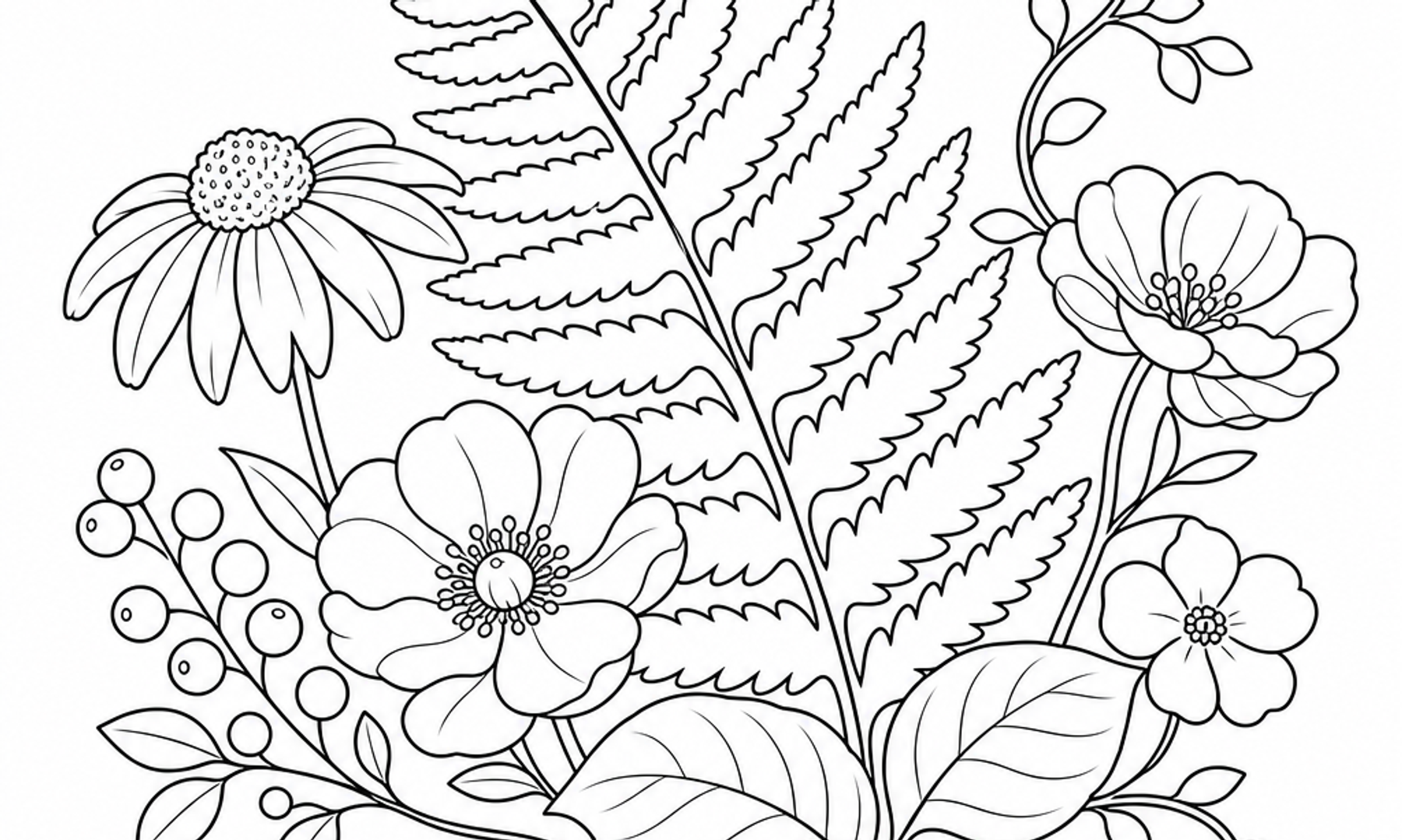
Walk through any garden, woodland path, or even a window box, and you'll notice that nature rarely repeats a color exactly. A single leaf might hold six shades of green, and a petal might shift from cream to rose in the span of a centimeter. Building a palette inspired by these subtleties is one of the most satisfying ways to deepen a coloring practice, and it doesn't require special training, just a willingness to look closely and experiment on paper.
This guide offers a practical routine for gathering color inspiration from the natural world and translating it into a working palette you can return to again and again on botanical pages. Along the way we lean on a few outside sources worth bookmarking: NHS Every Mind Matters on noticing the natural world, the Getty Museum's education department on the basic vocabulary of color, Legion Paper's interviews with colored pencil artists, the Library of Congress on handling paper, and the American Art Therapy Association on what distinguishes recreational coloring from art therapy.
Start by Observing, Not Collecting
Before reaching for pencils, spend a few minutes simply looking. The NHS describes mindfulness techniques that involve using all your senses outdoors, such as choosing a plant and observing "the different shades of green on the leaves" or feeling a petal between your fingers, as described on the NHS mindfulness page (NHS Every Mind Matters). You don't need a formal framework to borrow this idea. A short outdoor pause, even on a porch or balcony, can sharpen what you notice when you sit down to color. The same NHS resource notes that mindful living may help people feel calmer, though it does not claim this works the same way for everyone, and it is not presented as a treatment for any condition.
A Simple Observation Walk
- Choose one plant, flower, or tree and look at it for a full minute before moving on
- Notice where the color is darkest and where it's lightest
- Look for the least expected color in the scene, such as a purple shadow under a green leaf or a yellow undertone in bark
- Take a reference photo in natural daylight if you'd like to color from it later indoors
This kind of attentive looking is simply a way of gathering better raw material for your palette, not a guaranteed mood-changer. People vary in how they respond to slowing down outdoors.
Understand the Three Qualities of Color
Once you have a few references to work from, it helps to think about color in three parts: hue, value, and intensity. The J. Paul Getty Museum's education department describes these as core elements of visual art: hue is the color family such as red, green, or blue, value is how light or dark a color is, and intensity is how bright or dull it appears. Nature rarely uses a hue at full intensity. Even a vivid red tulip usually has duller, grayed-down reds in its shadows.
Why This Matters for Botanical Coloring
- Hue helps you choose a family: is this leaf a yellow-green or a blue-green?
- Value helps you build depth, since foliage without a dark and a light version of the same green can look flat
- Intensity helps you decide whether your page should feel closer to observed nature, with duller, mixed tones, or lean into a bolder, more graphic look
The same Getty resource notes that bright, undiluted colors tend to read as energetic, while dulled, mixed colors can create a calmer or more serious mood (https://www.getty.edu/education/teachers/buildinglessons/formalanalysis.html). Keep this in mind as you decide whether your botanical page should feel vibrant or hushed.
Build a Working Swatch Chart
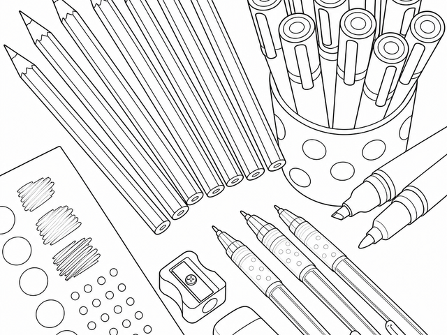
A swatch chart turns loose inspiration into a tool you'll actually use, and it's standard practice among working colored pencil artists. Megan Seiter, a botanical colored pencil artist interviewed by Legion Paper, suggests making a color chart whenever you try a new paper, since "your pencil colors will look different from one brand of paper to the next, and a chart will allow you to refer to your colors with accuracy and ease," as described in the Legion Paper interview series (https://legionpaper.com/blog/2021/10/11/choosing-a-paper-for-colored-pencil-art).
How to Make One
- Pull every green, pink, brown, and yellow pencil or marker from your current collection
- On a scrap of the same paper you plan to color on, make a small swatch of each one, labeled lightly in pencil
- Group the swatches by hue family, such as all greens together and all pinks together
- Note which ones layer well together by overlapping two swatches at a time
- Keep the chart nearby as a quick reference instead of guessing from memory
This step takes maybe twenty minutes and can save far more time later, especially when you're trying to match a specific leaf color across several pages.
Test on the Paper You'll Actually Use
Paper texture changes how a color behaves, sometimes noticeably. The colored pencil artists interviewed by Legion Paper reported different, sometimes conflicting, preferences, and the article itself frames these as individual working habits rather than universal rules. Sallyann, who draws from nature, favors Stonehenge paper because it "allows lots of layers" and is "neither too gritty nor too smooth" (Legion Paper). Megan Seiter, in the same article, prefers a toothier surface for building up many light layers without the paper becoming oversaturated with wax. Neither preference is a single correct answer; the source itself suggests there's no substitute for testing a paper yourself.
A Few Things to Test
- How many layers you can add before the paper starts to feel full or waxy
- Whether a light touch or firmer pressure gives you the botanical texture you want
- How the same green pencil looks on white paper versus a toned or kraft paper, since the base color shifts the final result
- Whether your paper handles blending tools without pilling or flaking
If you're coloring on loose sheets rather than a bound book, the Library of Congress's guidance on handling works on paper is worth borrowing loosely for storage, even though it's written for archival materials. It recommends keeping paper away from direct light, food, and drink, and avoiding fasteners or tape directly on the sheet, per the Library of Congress preservation guidance (Library of Congress). A coloring page doesn't need museum-level conservation, but a flat folder away from a sunny window will help keep your colors looking fresh longer.
Assemble Your Nature Palette into a Routine
With your observations, your swatch chart, and your paper tests in hand, you can assemble a working palette for botanical pages. A simple structure to try:
- Three to five greens, ranging from a cool blue-green to a warm yellow-green, plus one dark and one light version
- Two to three accent colors pulled from whatever flower, fruit, or bark tone inspired the page
- One to two muted tones for shadows, borrowing the idea that dulled colors tend to create a calmer mood
- A highlight color, often a pale cream or soft yellow, for sunlit edges
Keep this palette written down or taped near your coloring space. Over several sessions, you might build a small library of palettes: a forest-floor palette, a wildflower-meadow palette, a succulent palette. Returning to a familiar palette can make settling into a coloring session feel more like a routine and less like a decision every time.
A Note on What This Practice Is and Isn't
Building a palette and sitting down to fill in a botanical page can be a pleasant, grounding pause in a day, though how calming or absorbing it feels will vary from person to person. Coloring can be a self-care activity, but it is not art therapy or a substitute for mental-health care. The American Art Therapy Association is explicit that art therapy is a mental health profession practiced by credentialed clinicians with graduate-level training, and that recreational coloring activities, however enjoyable, should not be labeled art therapy, as stated on its official site (American Art Therapy Association).
Bring It to the Page
The next time you sit down with a botanical coloring page, try starting with ten minutes of looking, whether at a photo, a houseplant, or the view outside your window. Build a small swatch chart, test your paper, and let your palette grow slowly, page by page. Coloring Habitat's botanical designs are a natural place to practice this, one leaf, one petal, one quiet color choice at a time.