Pick a Light Source First: A Simple Shading Routine
A calm, practical routine for choosing a light source before you shade, so your coloring pages gain dimension instead of muddy, inconsistent shadows.
Why a Light Source Changes Everything
It's tempting to open a coloring page and start shading wherever a shape looks like it needs "something darker." But shading without a plan often leaves a page feeling patchy rather than dimensional. The fix is simple and takes about ten seconds before you pick up a pencil: decide where the light is coming from.
According to the J. Paul Getty Museum's educational overview of the elements of art, value (how light or dark a color is) is one of the core tools artists use to suggest three-dimensional form on a flat surface, and the illusion of space is achieved partly through shading techniques (getty.edu). The Getty page also points out that dark colors in a composition suggest a lack of light, while light colors describe where a light source falls or reflects within a scene. In other words, shadows and highlights aren't random decorations. They're a consistent story about where light is coming from, and your whole page reads more convincingly when that story stays consistent from one shape to the next.
This is a craft habit, not a hard rule. There's no single correct place to put a light source. The goal is simply to choose one on purpose and stick with it, so the shapes you color feel like they belong in the same space.
Choosing Your Light Source Before You Shade
Before coloring a single petal, leaf, or building, take a moment to decide:
- Where is the light coming from? Common, easy choices are upper left, upper right, or straight overhead. Picking a corner (rather than dead center) usually creates more visible shadow and highlight contrast.
- How strong is it? A single, strong light source creates deep shadows and bright highlights. A soft, diffuse light (imagine an overcast day) creates gentler transitions with less contrast.
- Is there more than one light? Most coloring pages read best with one dominant light source. Multiple competing lights can be fun to experiment with later, but they're trickier to keep consistent.
Once you've decided, a quick trick is to lightly mark a small arrow or dot in the corner of your page (in pencil, easily erased) as a reminder. This keeps you from "forgetting" halfway through and shading the wrong side of a shape.
A Simple Way to Practice
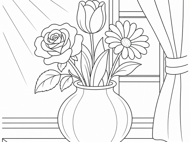
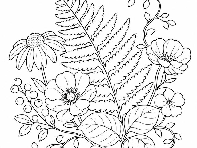
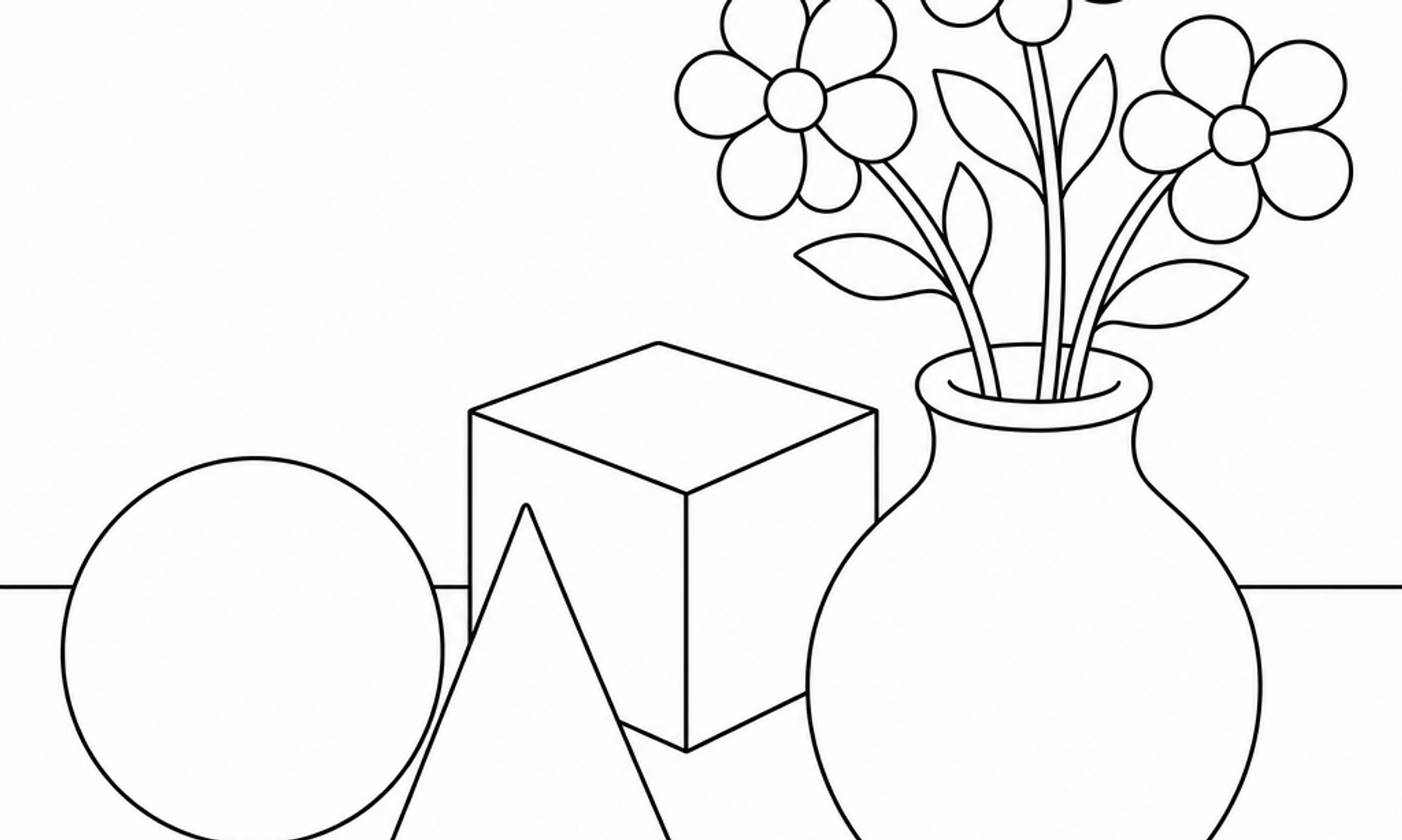
If you're new to this, try it on a page with repeating round shapes, like flowers, fruit, or a cluster of balloons. Pick upper left as your light source. On every rounded shape:
- Leave the upper-left area of each form lightest, sometimes even leaving a sliver of white or very pale color as a highlight.
- Gradually deepen your color as you move toward the lower right.
- Add the darkest value where the shape would logically block its own light, often the lower-right edge or wherever it meets another object.
Repeating this pattern across every shape on the page is what makes the light source feel real rather than accidental.
Building Dimension With Layers, Not Pressure
One of the most common shortcuts is pressing harder to make an area darker. That works to a point, but it often flattens the paper's texture and can make blending difficult later. A gentler, more controllable approach is to build value through layers.
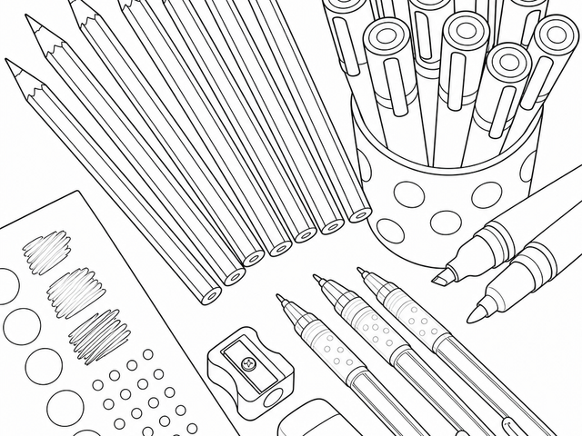
Colored pencil artists interviewed by Legion Paper describe this layering approach directly. Megan Seiter, a colored pencil artist who works in still life realism, explained that she builds each drawing with "dozens of light layers of pencil," which gives depth and luminosity to the work, and that her paper choice specifically supports this because it holds many layers without becoming oversaturated (legionpaper.com). This is one artist's documented preference and working method, not a universal rule, but the underlying idea translates well to a coloring page: light, repeated layers of pressure let you build shadow gradually and correct course if you've gone too dark too fast.
Matching Technique to Paper
The same Legion Paper piece notes that paper texture, often called "tooth," affects how pencil layers hold. Artists quoted there describe looking for paper that is "toothy without being heavily textured," and one mentions using a very sharp pencil with a light touch to fill the grain evenly. If your coloring pages are printed on smoother paper, a lighter touch with more layers will usually blend better than pressing hard early on. If you notice your paper has more texture, a few more layers may be needed before color looks solid. Testing on a scrap edge of the same paper before committing to a large shaded area is a small habit worth borrowing from working artists.
A Few Practical Shading Reminders
Here is a short checklist to return to each time you start a new page:
- Decide your light source direction before coloring anything, not partway through.
- Keep the highlight side consistently lighter across every shape in the scene.
- Build shadows gradually with light layers rather than one heavy pass.
- Use a sharp pencil point for controlled edges where shadow meets highlight.
- Step back periodically to check that the light direction still feels consistent across the whole page.
None of this needs to be rigid. Plenty of satisfying pages mix loose, intuitive shading with areas of flat, bold color, and there is no single "correct" artistic choice, as the Getty's own overview of visual elements makes clear. The point of choosing a light source isn't to pass a test. It's to give yourself one small, steady decision that makes the rest of the shading choices easier.
Caring for Finished Pages
Once you've spent real time layering shadows and highlights, it's worth protecting that work. The Library of Congress's preservation guidance for works on paper recommends keeping paper in a cool, relatively dry, stable environment, away from direct or intense light, and handling it with clean hands on a clean surface (loc.gov). This guidance is written for archival and museum materials, so a finished coloring page doesn't need conservation-level treatment, but the basic habits of keeping pages out of direct sunlight and storing them flat in a folder will help the colors and layered pencil work stay vivid for longer.
A Calm Corner, Not a Clinical Claim
Many people find that a quiet stretch of focused coloring feels grounding, and techniques like paying attention to small physical details are echoed in general mindfulness guidance from NHS Every Mind Matters, which describes noticing texture, color, and shape in your surroundings as one way to anchor attention in the present moment (nhs.uk). That's a general wellbeing tip about attention, not a claim that coloring itself is a validated mindfulness treatment, and individual experiences will vary. Coloring can be a self-care activity, but it is not art therapy or a substitute for mental-health care.
Try It on Your Next Page
Next time you sit down with a coloring page, pause before you pick a pencil. Pick a corner for your light, mark it if you need to, and let every shape answer to that same light as you work across the page. It's a small decision, but it's the kind that quietly turns a flat page into one with real depth, one layer at a time.